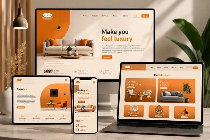
Read the first screen aloud
Look at the opening screen without scrolling. Can a new visitor tell what you do and where to go next? Avoid stacking several vague slogans before the service explanation. A strong headline, a short supporting sentence and a clear action usually give a better starting point than a busy collection of decorative labels.
Check the content order
On narrow screens, text and columns need a deliberate reading sequence. Put the explanation before a decorative visual when the visual requires context. Place form labels above fields and keep related information together. Test the actual page order with a keyboard or screen reader as well as with your eyes.
Look for hidden overflow
Long headings, fixed-width cards, tables, embedded maps and offscreen animations can push a page sideways. Check several widths rather than only one phone preset. Fix the element that creates overflow instead of cutting off meaningful content. Keep visual effects inside their section boundaries while preserving usable buttons and links.
Make interaction comfortable
Links and controls should have enough space around them. Important actions need visible labels and a clear focus state. Do not require hover to reveal essential content. If a card uses a reveal effect, make the tap behaviour predictable and keep the final navigation action easy to recognise.
Test an enquiry from start to finish
Fill in the form on a phone-sized layout, correct an invalid field and check the message preview. Confirm that telephone and WhatsApp links use the right number. Review the page with the keyboard open, with large text settings and in both orientations where practical. Document any devices you could not test.
A quick checklist
- Check small and large phone widths.
- Keep navigation and actions easy to reach.
- Verify the complete contact journey.